

If your website isn’t mobile-friendly by now, you’re not just behind the times—you’re actively losing customers. In 2025, having a mobile-responsive website isn’t just a nice-to-have. It’s a must. Whether you’re a local boutique, a growing e-commerce store, or a national service provider, your customers are browsing, buying, and booking directly from their phones.
The truth is simple: if your website doesn’t work well on mobile, your brand isn’t working well online. In this blog, we’re breaking down exactly why mobile-friendly website design is no longer optional and what’s at stake when you neglect this critical part of your digital presence.
A Brief History: How Google Changed the Game

Let’s rewind for a second. Google used to crawl the desktop version of your site first. If your desktop version looked great and had strong SEO, you were in decent shape.
But all that changed with Google’s Mobile-First Indexing, which began rolling out in 2016 and became the default for all new websites by July 1, 2019. By 2021, Google had shifted almost all sites to mobile-first indexing. That means:
Google now uses the mobile version of your website as the primary version for indexing and ranking.
If your mobile site is slow, broken, or missing key content, that’s what Google sees. Not your pretty desktop layout. Not your carefully designed homepage with just-the-right hero banner. If your mobile site is a mess, your SEO rankings will follow suit.
“Mobile-first indexing means Google predominantly uses the mobile version of the content for indexing and ranking.” – Google Search Central
Still clinging to a desktop-only design? That’s like handing Google a flip phone in a smartphone world.
Stat Check: Most Internet Traffic is Mobile
You might think, “Well, my audience uses desktops.” Think again.
According to Statista, over 58% of global website traffic came from mobile devices in 2023, and the number continues to rise in 2025. That means more than half of your potential customers are landing on your site with a smartphone in hand.
In fact, HubSpot reports that mobile users are 5 times more likely to abandon a website that isn’t mobile optimized. Five times! That’s traffic and revenue walking straight into the arms of your competitors—just because your site was hard to use on a phone.
Mobile Website Design Impacts Your Bottom Line

Here’s what happens when someone lands on a site that’s not mobile-friendly:
- Text is too small to read
- Images are cut off or don’t load properly
- Buttons are too close together
- Pages take forever to load
- The layout looks like a jumbled puzzle
Frustrated users bounce. Quickly.
And when people bounce, Google takes notice. Bounce rates and session times are part of the ranking equation. If users leave your site immediately, it signals to Google that your content isn’t valuable—or usable.
On the other hand, a well-designed mobile site keeps users engaged, encourages interaction, and improves conversions.
What “Mobile-Friendly” Really Means
Let’s be clear: a mobile-friendly website isn’t just a shrunken version of your desktop site. It’s a site specifically designed for smartphones and tablets. That means:
- Responsive design that adapts to all screen sizes
- Readable fonts without zooming
- Touch-friendly buttons and navigation
- Fast loading speeds
- Streamlined menus and forms
- Optimized images and compressed files
It’s not enough to “sort of” work on mobile. Your site should shine on mobile.
Mobile Design is User-Centered Design

When someone pulls out their phone and visits your site, they’re likely:
- Looking for a product
- Trying to find contact info
- Searching for directions
- Booking an appointment
- Reading a blog post
- Comparing services
They want speed, clarity, and ease of use. Not pinching and zooming and cursing under their breath.
Mobile-first website design puts the user experience at the center. It strips away clutter and focuses on what matters most to your customers. Think clean interfaces, clear calls to action, and simplified journeys from homepage to conversion.
Speed Matters: Mobile Performance and SEO

According to Google, 53% of mobile users abandon a site if it takes longer than 3 seconds to load. That’s barely enough time to blink.
Slow sites don’t just frustrate users—they hurt your SEO.
Page speed is a confirmed ranking factor. A slow mobile site can drag down your search visibility even if your content is stellar.
To speed up your mobile website:
- Compress images
- Minimize code
- Use lazy loading
- Choose a fast, mobile-optimized theme
- Reduce redirects
- Enable browser caching
Fast sites win clicks, conversions, and Google’s love.
Better Mobile UX = Higher Conversion Rates
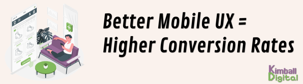
You’ve done the hard work of getting someone to your site. Don’t lose them at the finish line because your “Buy Now” button is too tiny or the form takes 10 minutes to fill out.
Research from Think with Google shows that mobile-friendly websites have up to 67% higher conversion rates than non-optimized sites. That’s a massive difference.
Whether you’re selling products, collecting emails, or booking appointments, your mobile experience directly impacts your revenue.
Great mobile design removes friction. It guides users toward the action you want them to take—without making them work for it.
Mobile Design and Local Search

If you have a physical business location, mobile optimization is even more critical.
Why?
Because mobile searches are often local. People on the go are searching for:
- “Restaurants near me”
- “Dentist open now”
- “Hair salon in [city]”
According to Google, 76% of people who search for something nearby on their smartphone visit a business within a day, and 28% of those searches result in a purchase.
If your site isn’t mobile-friendly, you’re missing those opportunities. A clean mobile site that loads quickly and provides contact info, directions, and services upfront gives you a huge edge.
Mobile-First Means Future-Proofing
Let’s face it: the mobile web isn’t the future. It’s the now. But as tech continues to evolve—think wearable devices, smart TVs, and foldable screens—mobile-first design lays the foundation for all future screens.
Responsive, scalable website design ensures your site can adapt to any new device format that comes along.
Plus, voice search and AI assistants are growing. Mobile-friendly websites that load quickly and provide concise, structured content are more likely to be selected for voice search responses.
Your website should be ready for whatever comes next.
Signs Your Website Needs a Mobile Overhaul
Still not sure if your site is truly mobile-optimized? Run through this checklist:
- Do your pages take longer than 3 seconds to load?
- Are your buttons easy to click with a thumb?
- Does your text resize properly on mobile?
- Are any images overlapping or cut off?
- Is your navigation menu mobile-friendly?
- Is your contact info easy to find and click?
If you answered “no” to any of those, it’s time to upgrade your website design strategy.
Use Google’s Mobile-Friendly Test to check your current site performance.
How to Upgrade to a Mobile-First Website Design
If you’re ready to build a better mobile experience, here are some practical steps:
1. Start with Responsive Design
Choose a responsive theme or framework that adjusts to all screen sizes seamlessly.
2. Prioritize Core Pages
Ensure your homepage, product pages, contact page, and blog are all mobile-optimized.
3. Simplify Navigation
Keep menus short and easy to tap. Use collapsible sections and logical hierarchy.
4. Optimize Forms
Reduce the number of fields and use mobile-friendly form inputs.
5. Use Mobile-Friendly CTAs
Make your calls-to-action big, bold, and easy to click.
6. Test Frequently
Use tools like Google Search Console, Lighthouse, and BrowserStack to test across devices and identify issues.
Website Design in 2025: It’s Mobile or Bust
We’re not exaggerating when we say your website design needs to be mobile-first in 2025. It’s not a trend. It’s not a bonus feature. It’s the bare minimum if you want to stay visible, competitive, and profitable online.
Your customers are mobile. Your competitors are mobile. Google is mobile.
So why are you still stuck on desktop?
Final Thoughts: Don’t Wait to Modernize
If your current website still looks (and acts) like it was built in 2010, now is the time to upgrade. A modern, mobile-first website:
✅ Improves SEO rankings
✅ Increases user engagement
✅ Boosts conversion rates
✅ Enhances brand credibility
✅ Future-proofs your digital presence
The longer you wait, the more money you leave on the table—and the harder it is to catch up.